The process: Creating translucent Skies
I've been reading a book about design and it says that it's a good practice to document your work. So I thought that would be a fun idea for a page on here. I'm uploading in hopes that it can be useful or at least interesting if you were wondering how I made the Cyberspace Highway Motel.
the beginning
It started when I discovered NeoCities and I knew I wanted to make a site. Maybe a blog, maybe something else, maybe both.
To begin, I started browsing NeoCities to see what people use their sites for and what they included in them. This was a more of a passive activity than actual research. I just wanted to look at cool sites and imagine what mine could be. I also started making a mental list of things I would like to feature and the ways that I would personally implement them.
Before starting to create, I needed to have an idea of what was actually possible. And the use that base to start having my own ideas.
I also took a look at the source of this old-web revival as a whole: GeoCities.
I started wondering: Why even make a whole website? Like, what do I have to offer? Do you even have to offer anything at all?
I guess I didn't want this project to feel egocentrical or pretentious.
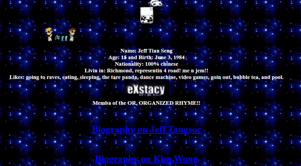
So I went to look at old websites. And it was amazing to see that the desire to express yourself on the Internet actually predates Social Media. People made sites just because they could. And I have fun watching those sites, those slices of stranger's lives. So why not make my own?
Defining an Aesthetic
I’ve mentioned it before, but the whole idea guiding this site is to recapture the feeling of wonder that I had when browsing the web as a kid .
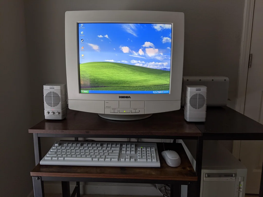
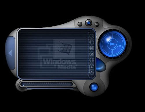
In order to translate this to an aesthetic, I looked for things from around the same time that evoked that feeling. I grew up in the 2000s. So for me, computers were: boxy monitors, glossy UIs, startup sounds and a picture of a green field. And the coolest of technology was enclosed in transparent plastic and had a lot of curves.
To express what I mean, here's a list of things I wrote in my notebook:
- The wonder of the Internet when I was little
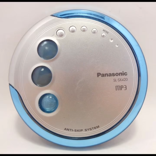
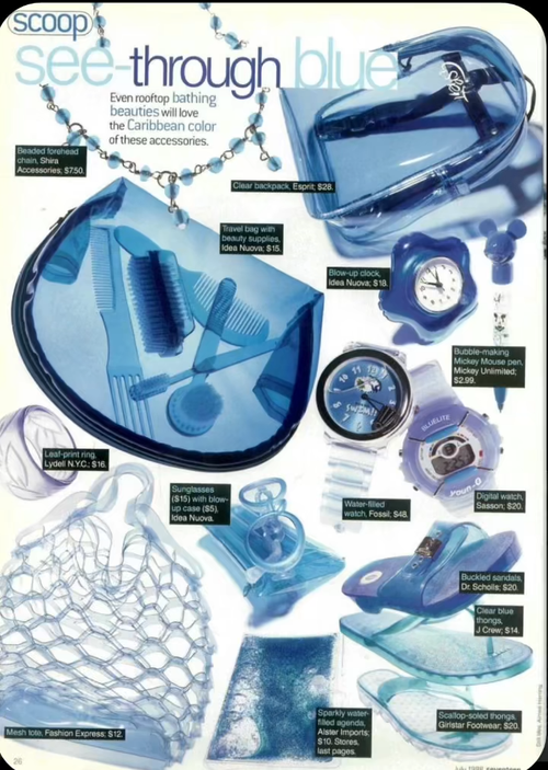
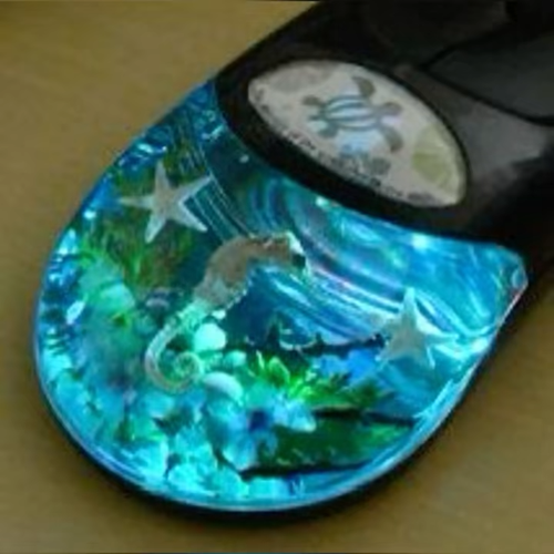
- Electric blue, translucent plastic, chromed metal
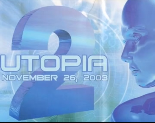
- Y2K futurism
- Low Poly
- Win XP
- The cyberspace as an actual space
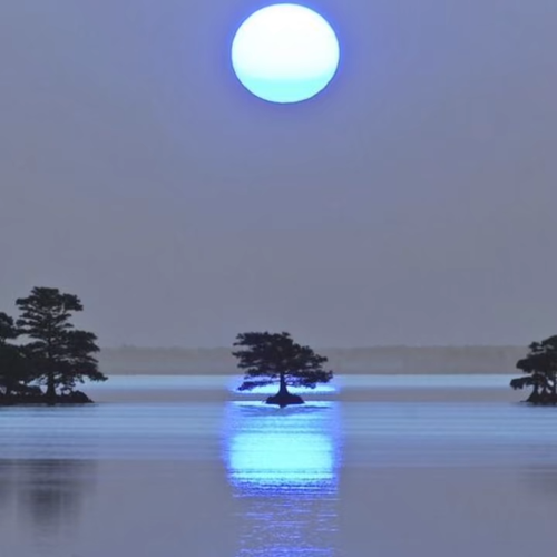
- Landscapes of the sea, green meadows and highways
-
Roadside Motels, or places of rest
- More like an infinite hotel (like the famous paradox)
- A motel turned museum
To describe this in modern visual style labels, my main inspirations are the Y2K (with a little bit of frutiger aero) and Low Poly aesthetics, because I fell that they evoke the technology that defined my early years. And something between dreamcore and liminal spaces for the Motel part. It’s kinda like an amalgamation of styles that I’ve fell in love with in the past few years. Which takes me to the next point:
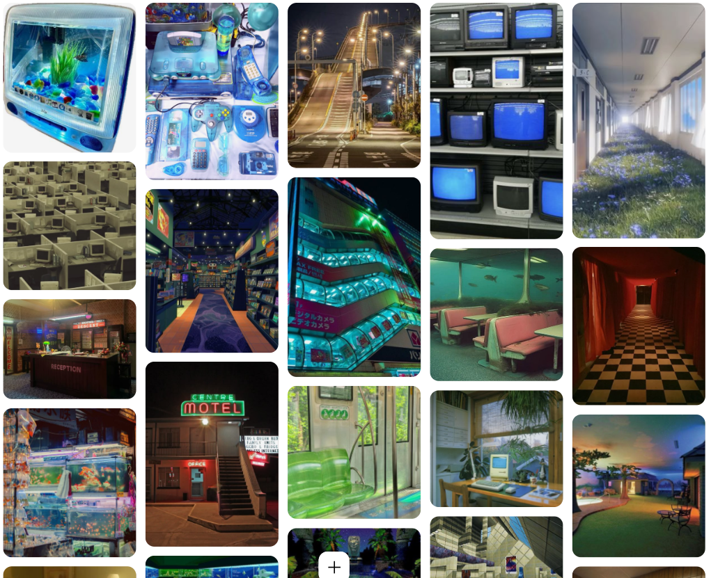
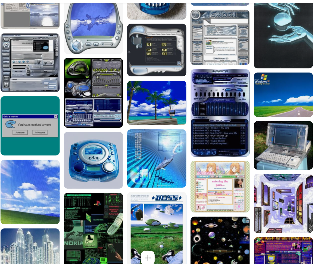
Looking for references

People talk a lot of shit about TikTok (rightfully so), but I personally find it really useful. Specially because it allows me to be exposed to new things in a passive way. I don't have to be actively looking for inspiration or references, I can just find them in between a meme and a video of a cat.
People post videos or slideshows showcasing or talking about aesthetics/movements/styles, like this. And everytime I see one that I like, I save it to a playlist.
And so, my first step was to go through it and download what I found useful for this project.
Then, for more active research, I made and account on Pinterest and started looking for images on the same line. Y2K, Clear Craze, 2000's UI, rave flyers, Webcore.
I also expanded my search a little more into liminal space/dreamcore stuff. I didn't want the site to be only Y2K without substance, I also wanted to play way more into the whole Motel idea. I believe that for now, I haven't explored that theme as much as I'd like to, but I plan on making the Site more immersive and thematic.
Next Step: Learning to code
Before continuing with the visual design of the site, first I needed to actually know how to code. That way I would knew what was really possible on the first place. I spent a couple of months following the MDN courses on HTML and CSS.
Parallel to the course, I kept coming up with ideas, browsing sites, and looking for references.
Learning new concepts actually became a new source of ideas. And just as I learned to do something new on the course, I tried it out for my site. For example, once I knew enough HTML and CSS to create blocks and give them colors, I started trying to design the main "window frame" that I use on all my pages. And once I learned to do layouts with the grid function, I started toying around with the design of the homepage.
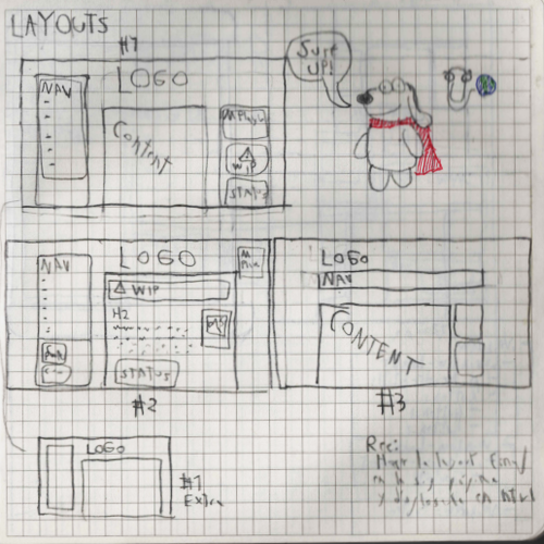
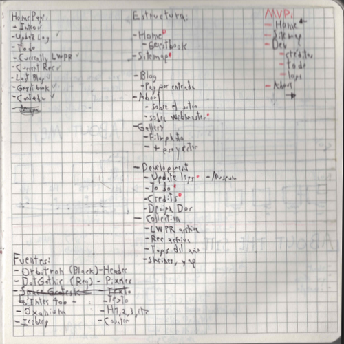
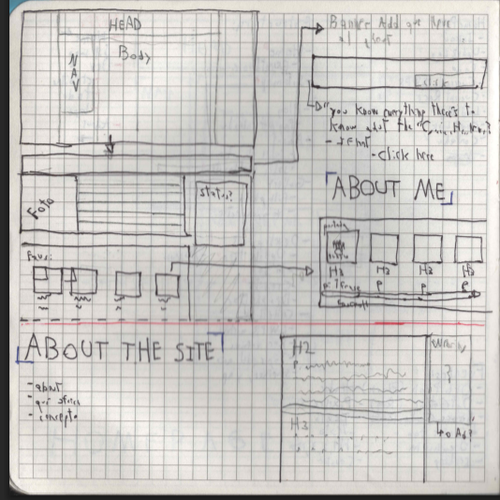
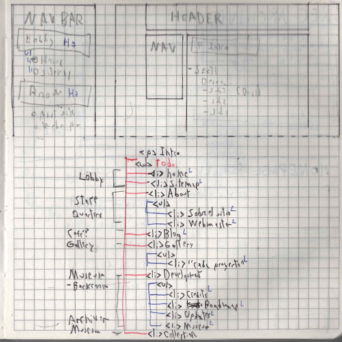
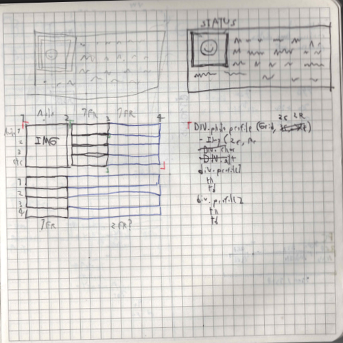
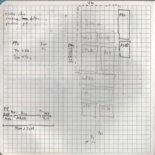
Sketching
Ok, at this point: I knew what I wanted to make, how I wanted it to look, and was starting to understand how to code. So, this was the moment to actually start creating. And the first step for that, was visualizing my ideas. These are some of the sketches I made:
Also at this point you may notice that I tend to mix a lot of Spanish and English when working on things. Actually, if you look at the code of the Site you'll find the same pattern. I guess there was no way that this website wasn't going to be bilingual.
Actually making the website
And now, all that was left was to actually start making the website. This took me months, and it was basically me going between writing code, sketching and thinking and writing the actual text content. So I'll just highlight some of the fun ideas and processes that I went through:
The header
Originally, the Site was only going to be called "Cyberspace Highway Motel" . But then I came up with another name, "Translucent Skies", and I liked it too much to not use it. I came up with a compromise, which was just using both.
I decided that TS was going to be the main title and CSHM more of a subtitle. I've always loved extremely long titles anyways. The problem with that is fitting both in to a decent looking logo for the header.


And taking advantage of my now double title, I could combine two styles. I wanted the first one to lean fully into the Y2K retrofuturism and the second one to go for the roadside motel vibe.
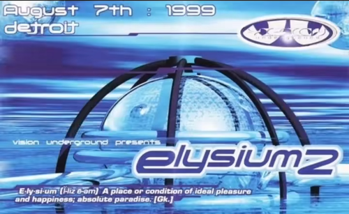
Translucent Skies is heavily inspired by the typography on those Y2K rave flyers from the 90s. I showed some of those earlier. It consists of a text in html with a color, outline and shadow, and I'm very happy with how it turned out.
For the motel part, I initially wanted it to look fully like a roadside sign. So I went with Neon-like font. But it just didn't work
Then I tried a different approach, this time inspired by the text boxes of windows95 and PS1 era RPGs. It's a sign, but not one you'd see on a real life road, it's one that would appear if you were in a Cyberspace Highway.
And about the picture, well I really like clouds and skies so I have taken a lot of photos like that. I took one and edited a little to look like it came from a digicam.
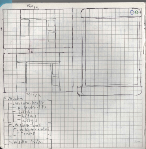
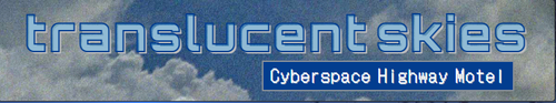
Layout and Windows
From the start, I knew I wanted my site divided into visible boxes.
I saw a lot of sites in which the used boxes made to look like the windows of Windows 95 or XP. I really liked that, and wanted something similar, but I wanted to make my own design. So I came up with the idea of doing it like it was a fictional Operative System. Something very retrofuturustic from the 2000s. Inspired by the crazy UIs people did for media players.
Each window element is made of a header, a footer, a body (the translucent blue part) and a content box(the white one). And the base layout for a page is two windows below the header: a smaller one for the Nav Menu and a bigger one for the main content of the page
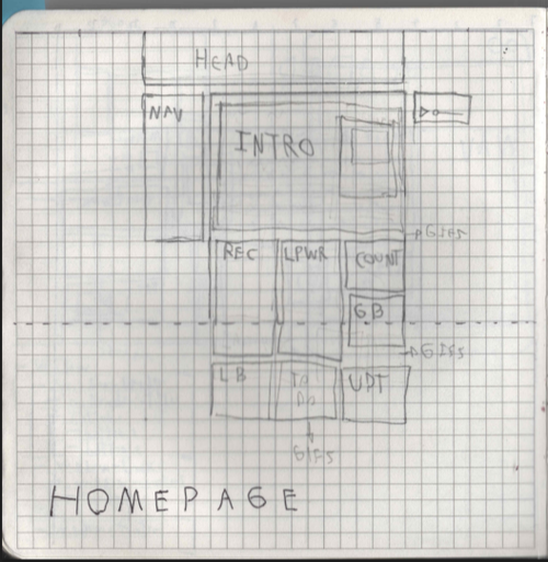
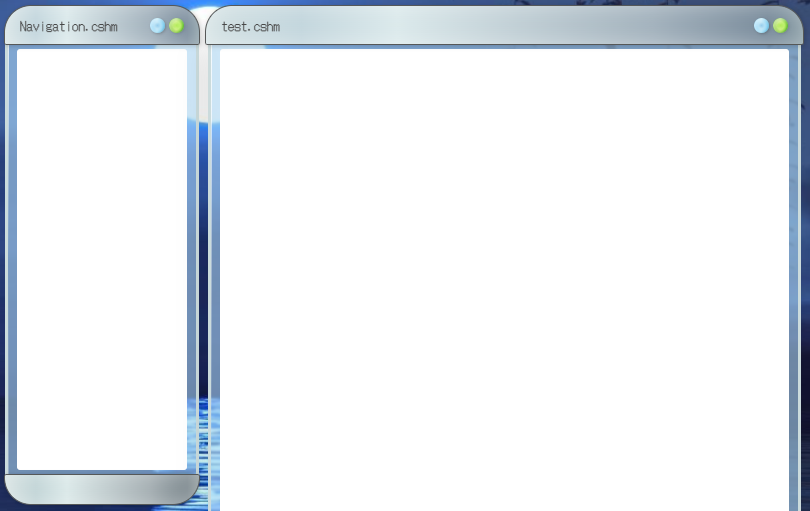
The homepage and the sub-windows
The first page I started working on was the Homepage. Which is also probably the most complex of them all.
Initially, I wanted each section on a page to be inside its own window. But I soon realized that it looked too cluttered and wasn't gonna work.
Instead I tried adding more than one window-content element per window. Make smaller white squares inside the translucent blue container. And to mark each section, I added title frames based on the header
How does this tie in with the OS idea? Well, I see it like this:
- A first layer that is the OS. Retrofuturistic, clean and round.
- A second layer. Less clean, more simple. Based on the old web aesthetic.
So it's like you're using your OS to access the internet. I'm very satisfied with it. It gives a me very visual way to implement hierarchy on the content of a particular page and the ability to do complex layouts without it looking too cluttered.
The next steps
After all this work, all that was left was to actually create the content for the website.
The good thing is that I've already created these basic elements and internal rules that serve as the building blocks of the whole Website. So, to create a new page I can start from a basic template and go from there.
Also, I design new elements or blocks as I need them or as I learn new things. For example, for this page in particular I made that slideshow/gallery you saw earlier. And now, I plan on using it everytime I want to showcase multiple images at once.
So basically, this is how I made this website. I hope you found it interesting or useful.